
How to read a stock chart
Understand the essentials and spot what counts

👋🏼,
Hope you’re having a good week so far!
Whenever I used to look at stock charts I’d stare at the screen for 10 seconds and then close the browser in the hope that I’d be able to understand it one day.
Lines zig-zagging everywhere, acronyms I’d never heard of, and numbers that felt more intimidating than a high school math exam. I remember thinking, Who even understands this stuff?
I started small, learning one piece at a time, and slowly, the chaos turned into something useful. These charts weren’t just random scribbles - they were stories.
They showed me how companies grew (or didn’t), how the market reacted to big news, and even how investor emotions played out over time.
My guide on how to read a stock chart will walk you through the basics of reading a stock chart - as always, no financial jargon, no confusion.
I’ll cover:
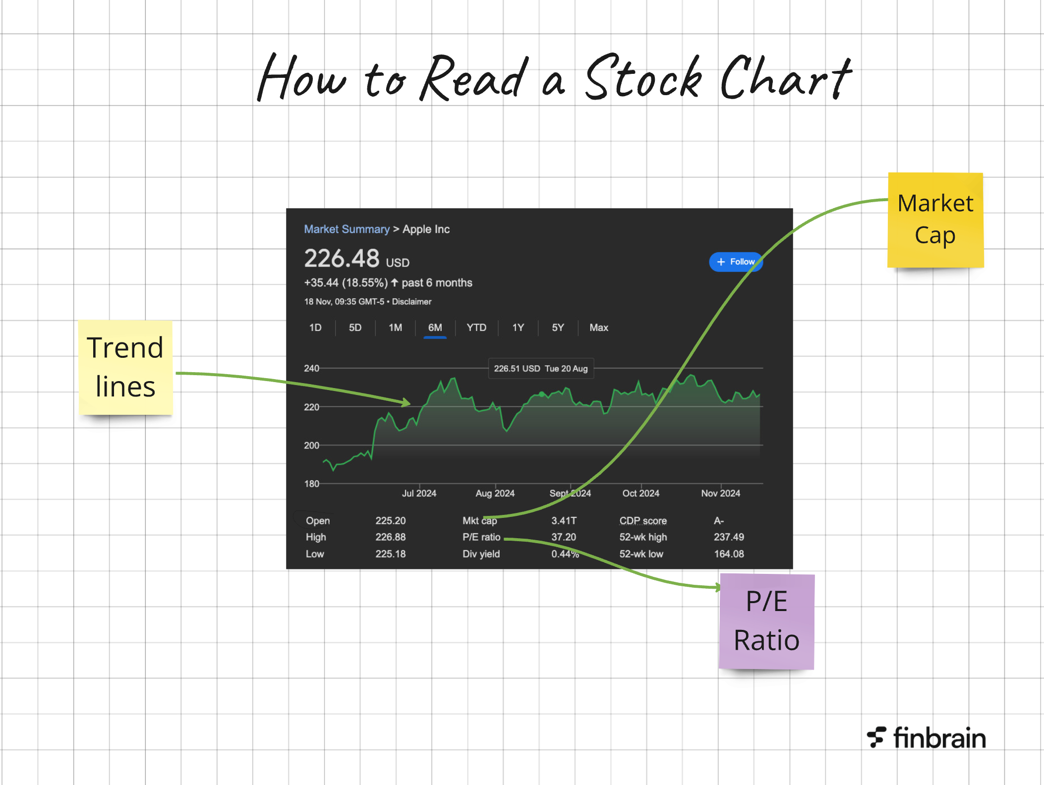
What is a stock chart?
The must-know elements of any stock chart
Basic
Advanced
📹 Explainer
What to look out for on a stock chart 🧐
Best (free) stock chart platforms